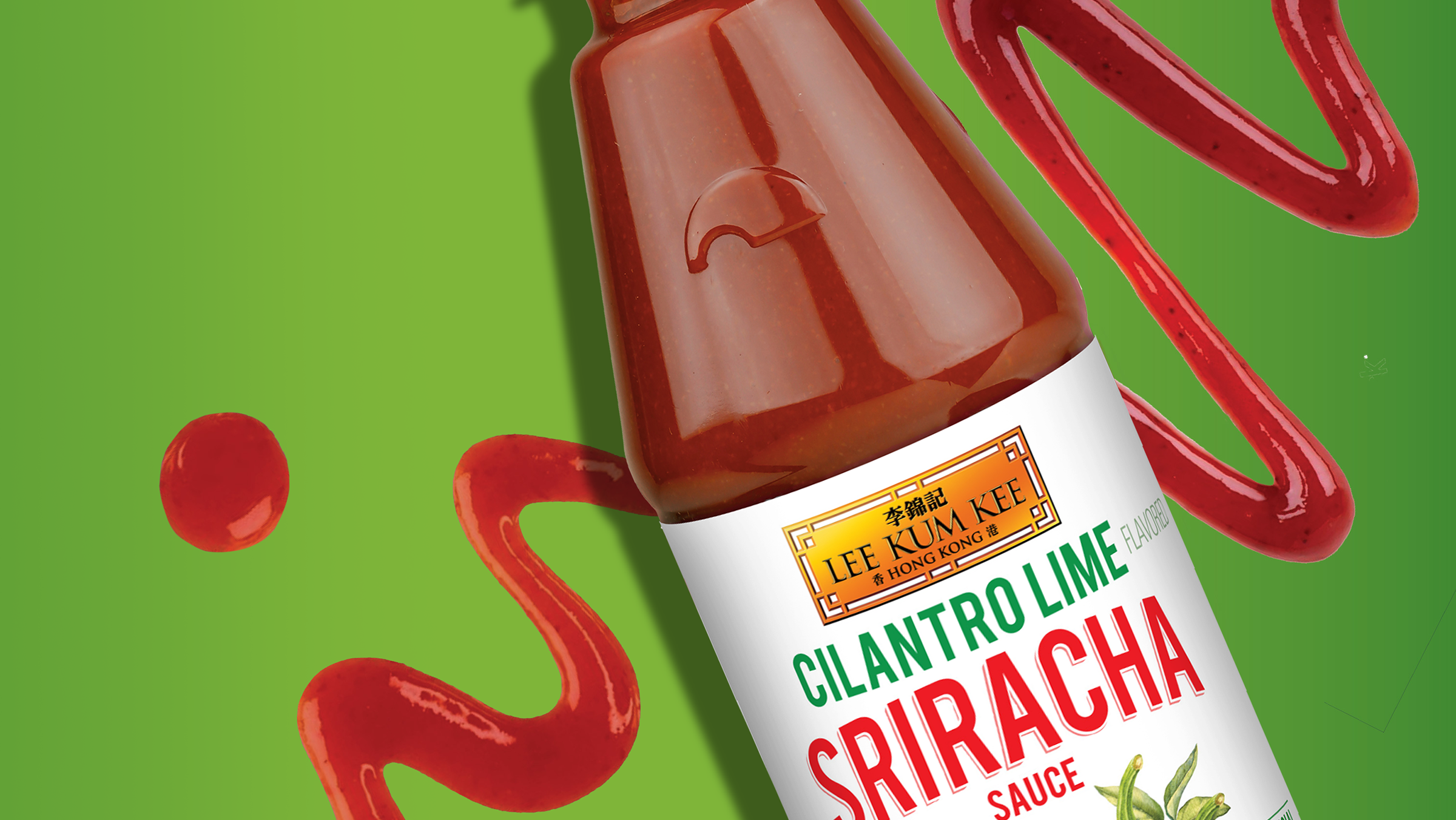
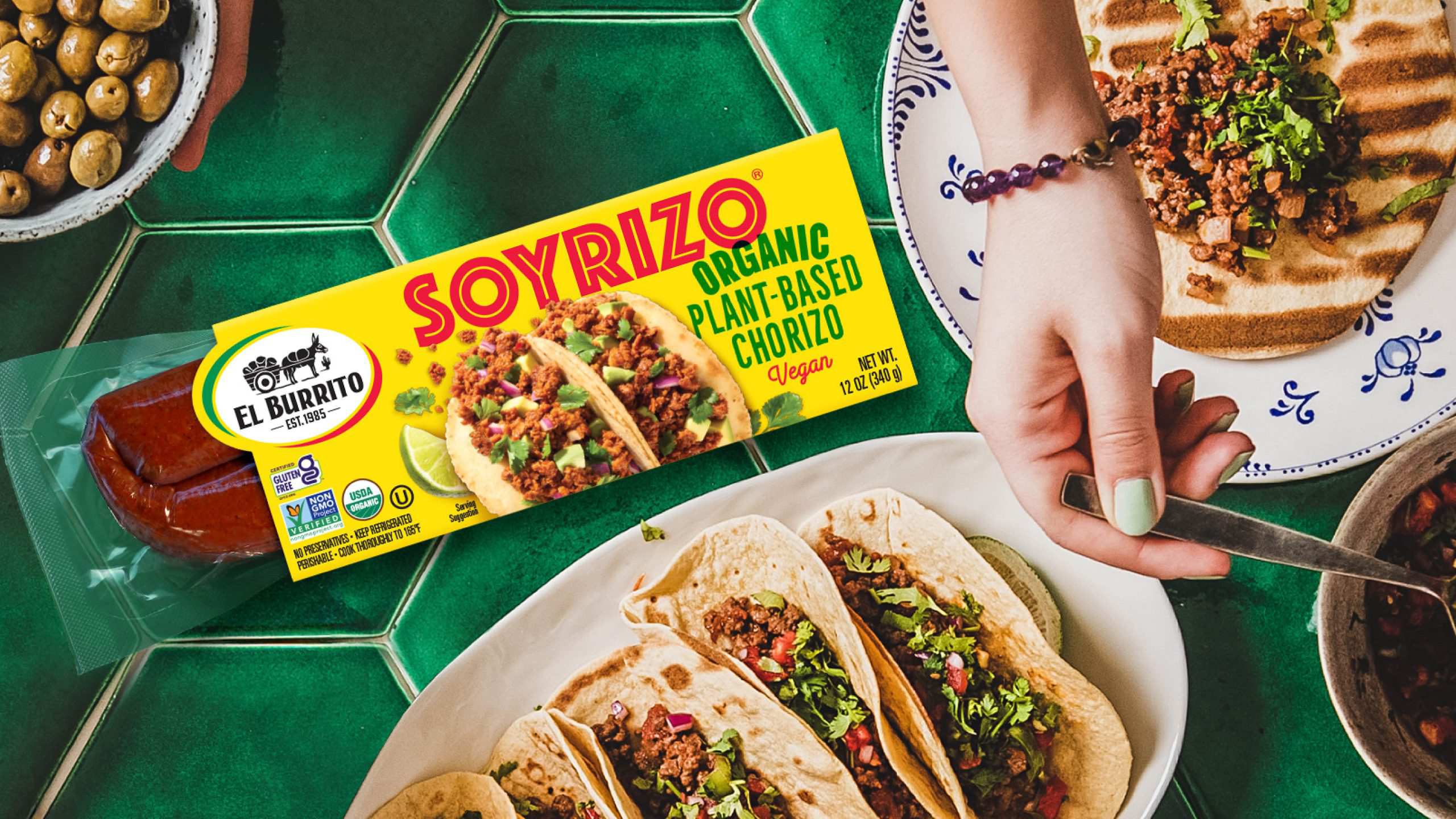
Packaging Redesign - Role: Senior Designer at The Clorox Company
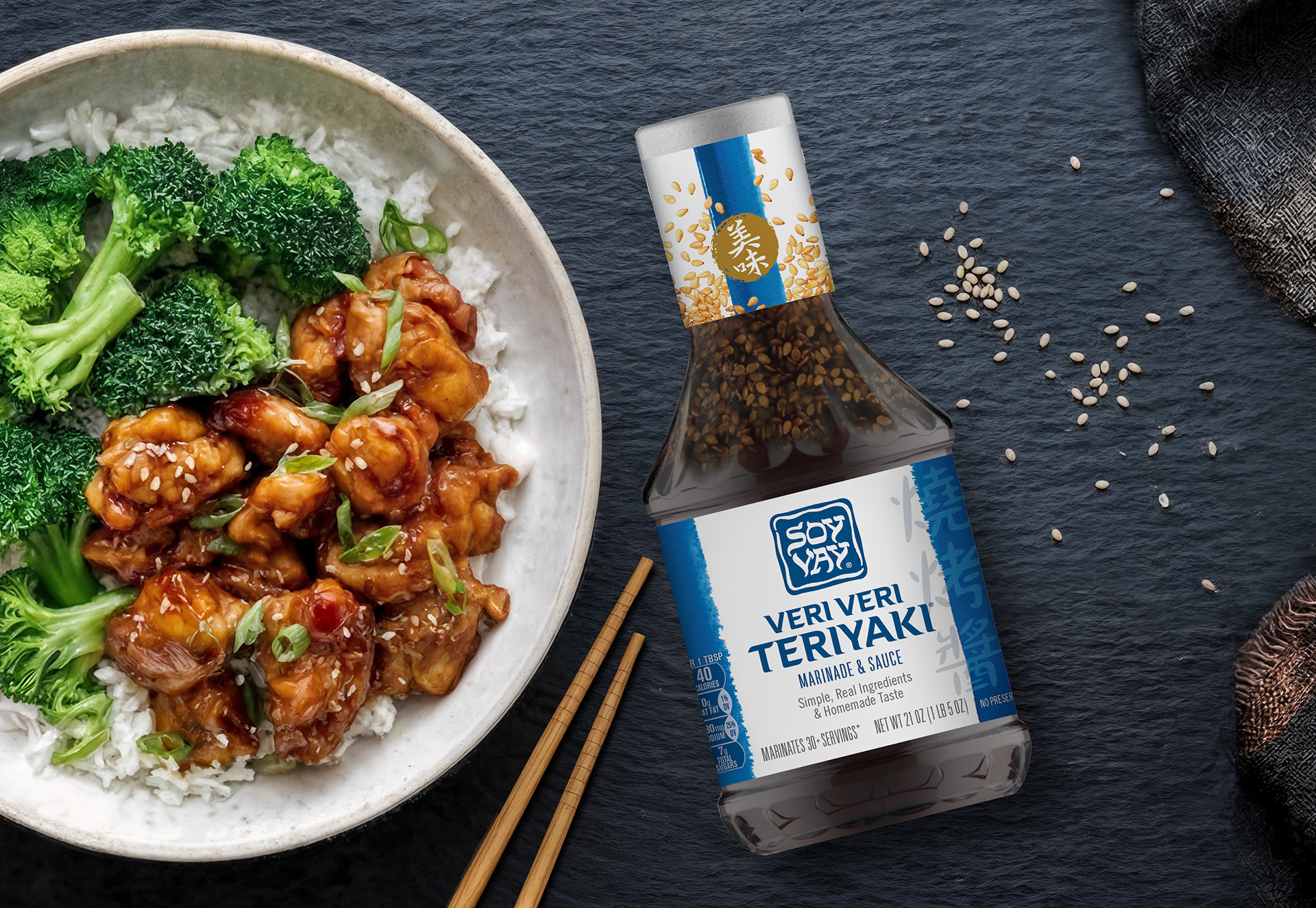
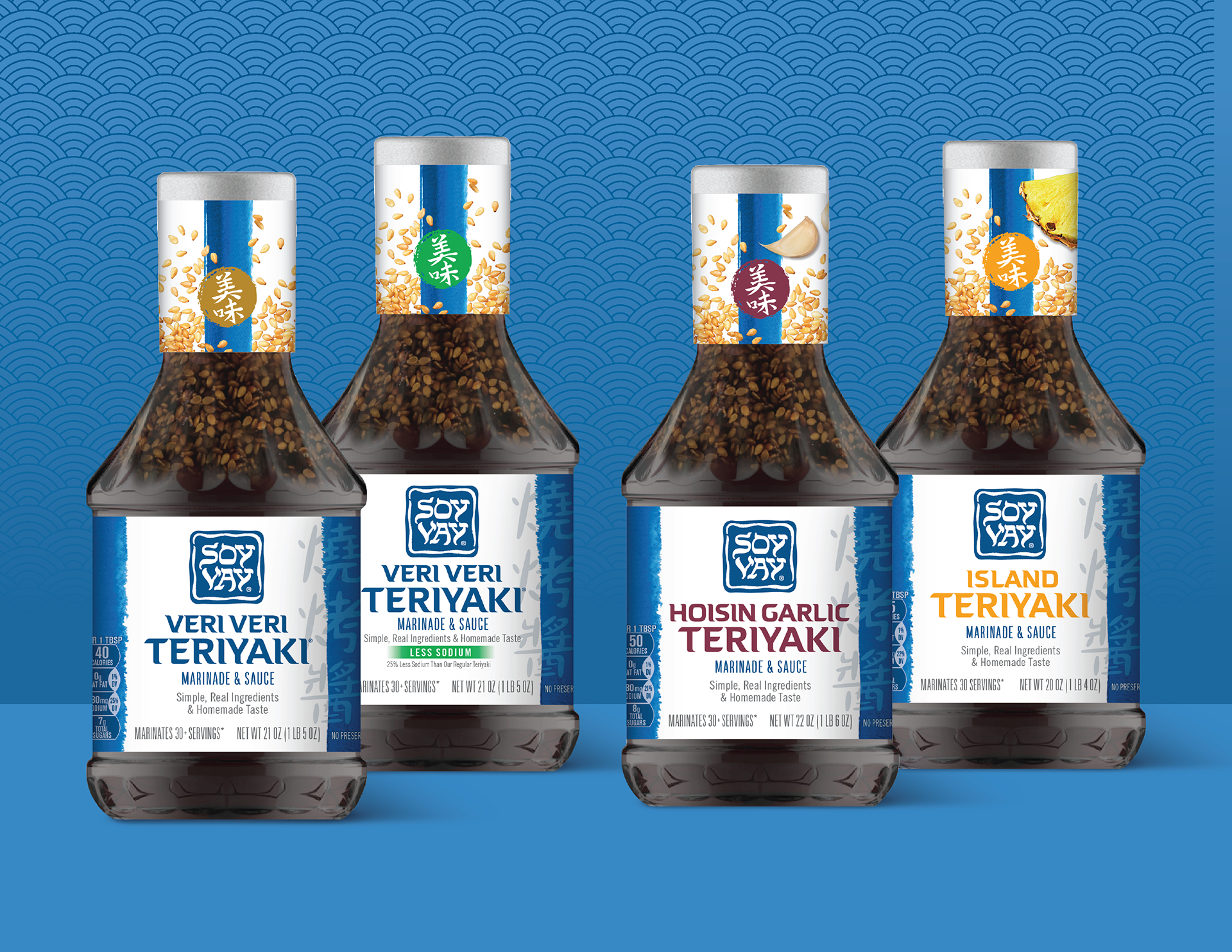
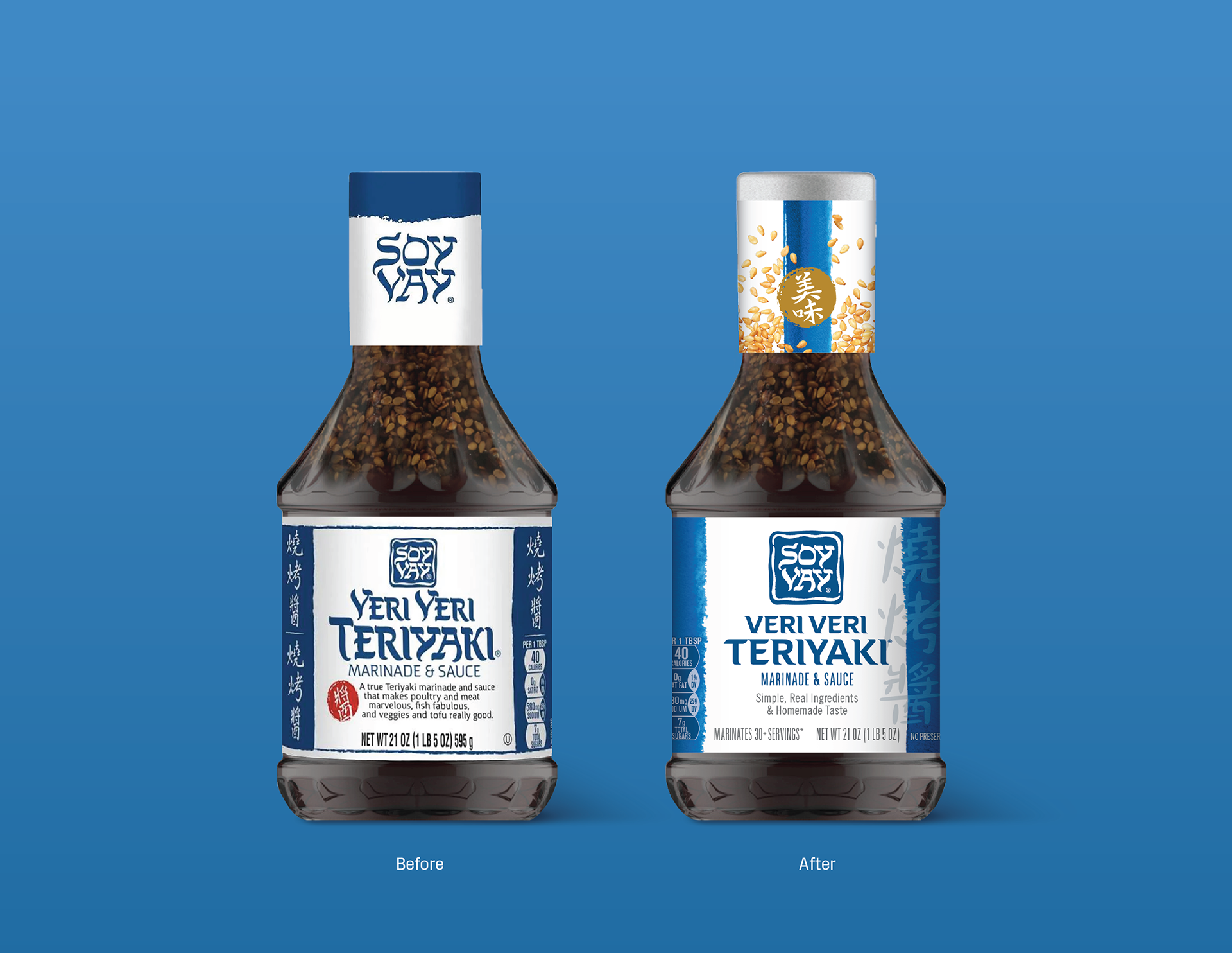
The competitive set for marinades has been growing for years, and Soy Vay sought a design refresh to increase brand awareness and simplify communication hierarchy. My evolutionary approach maintained the basic label architecture while bringing more distinction to the design elements. The Hebrew-inspired lettering was reserved for the brandmark only, so that the flavor names would be more legible for easy selection at shelf. The neck label became a canvas for flavor communication and appetite appeal. The final result was an old favorite, thoughtfully updated.